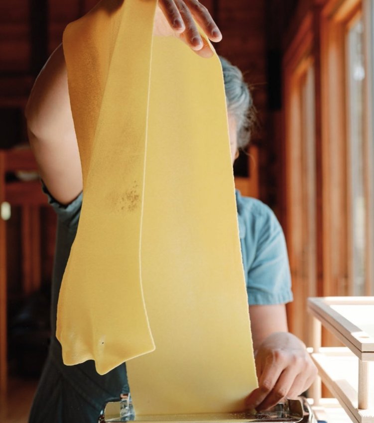
Katie Leaird is a writer, recipe tester, food stylist, and (most importantly) a pasta pro.
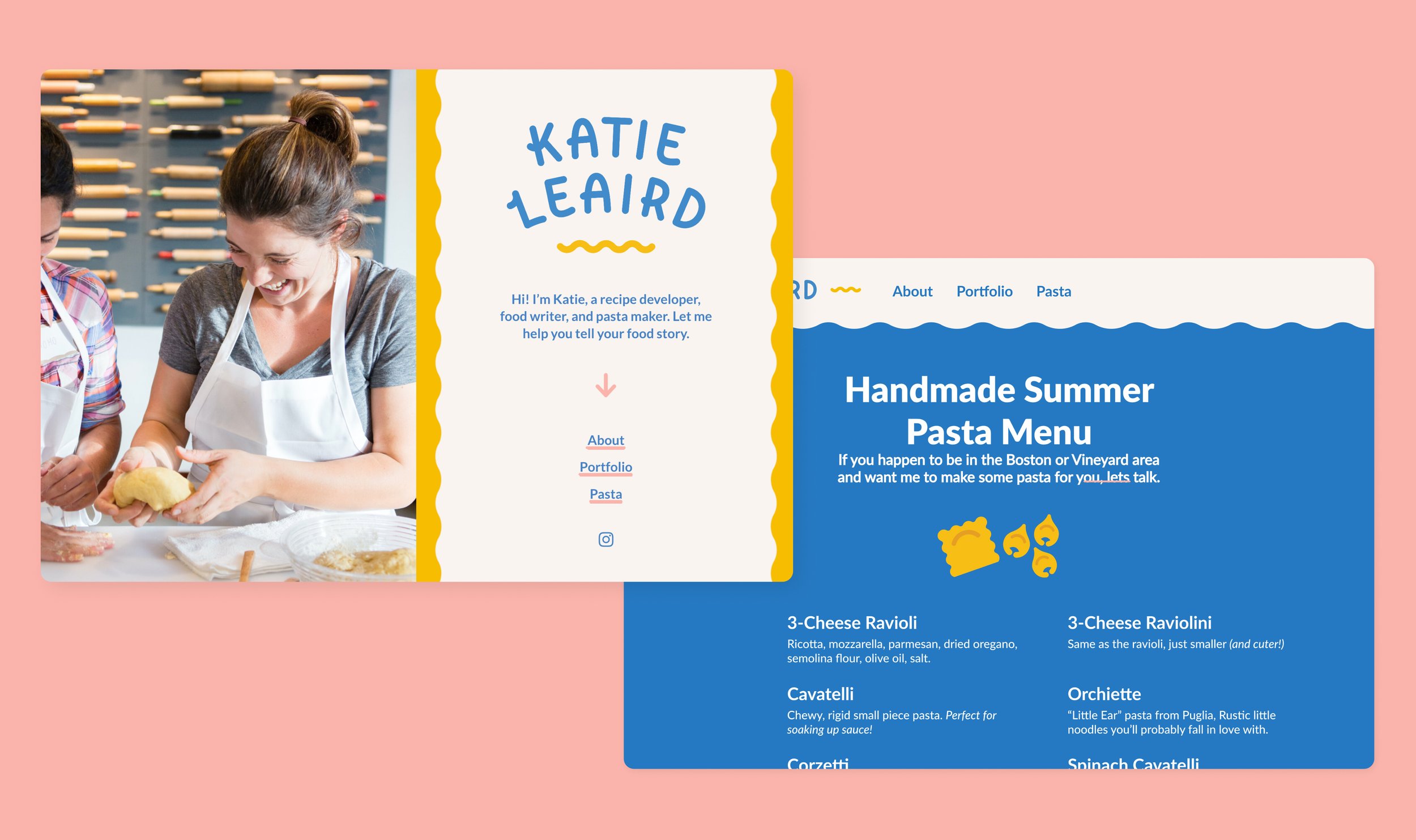
When striking out on her own she needed a personal brand system that reflected the perfect balance of fun and professional, a true reflection of herself.
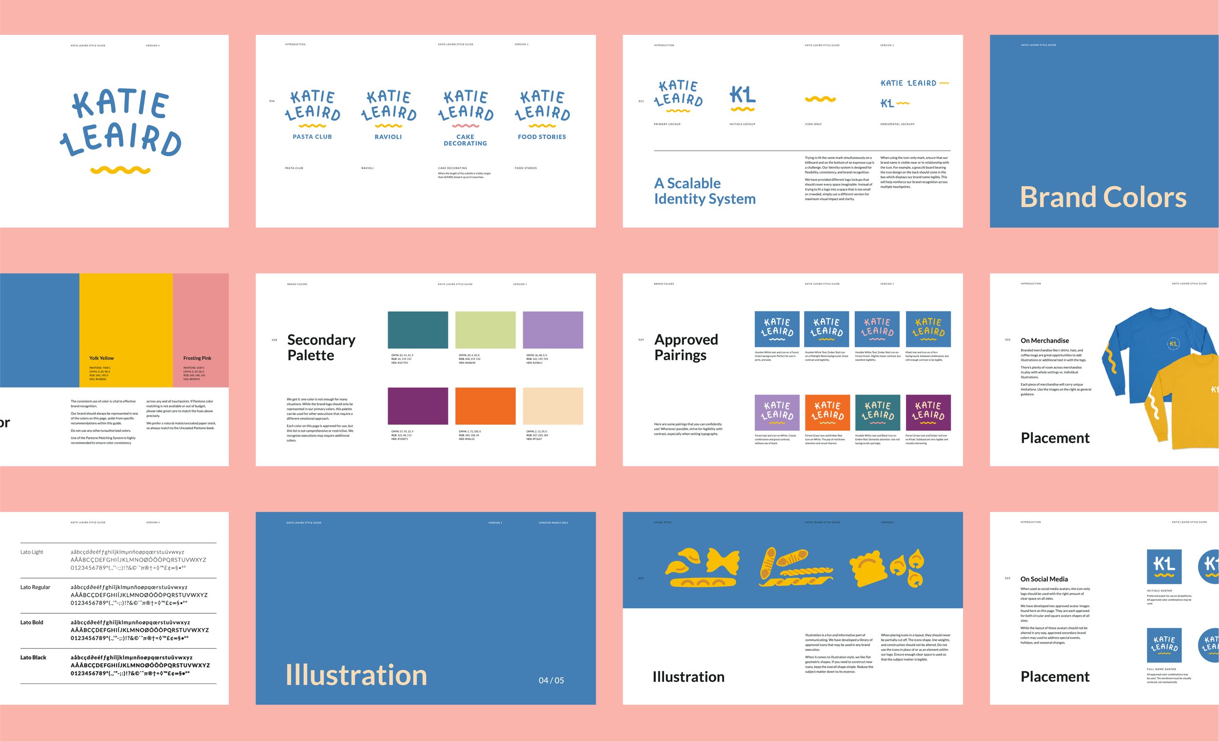
Our goal wasn’t small, Katie needed a brand that could easily encompass all the value she brings to the culinary world. One that could serve her handmade pastas for sale in Martha's Vineyard, her series of extravagant cake recipes, as well as her writing for major publications; via food stories, recipes she’s developed and cooking equipment tests.
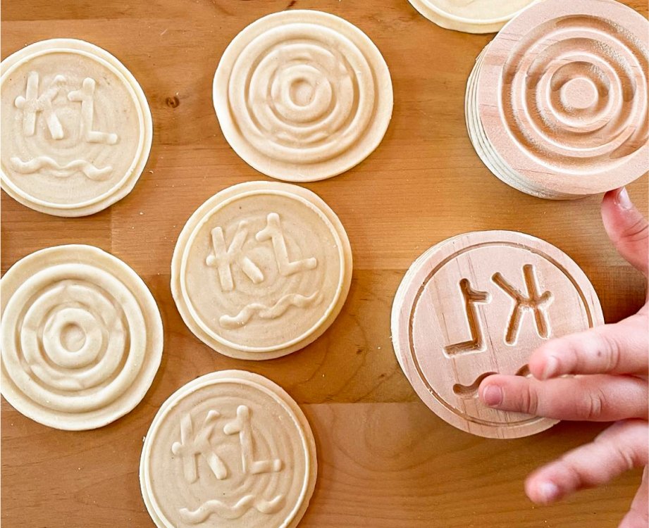
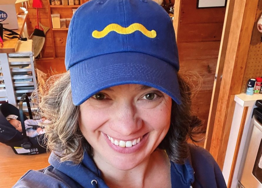
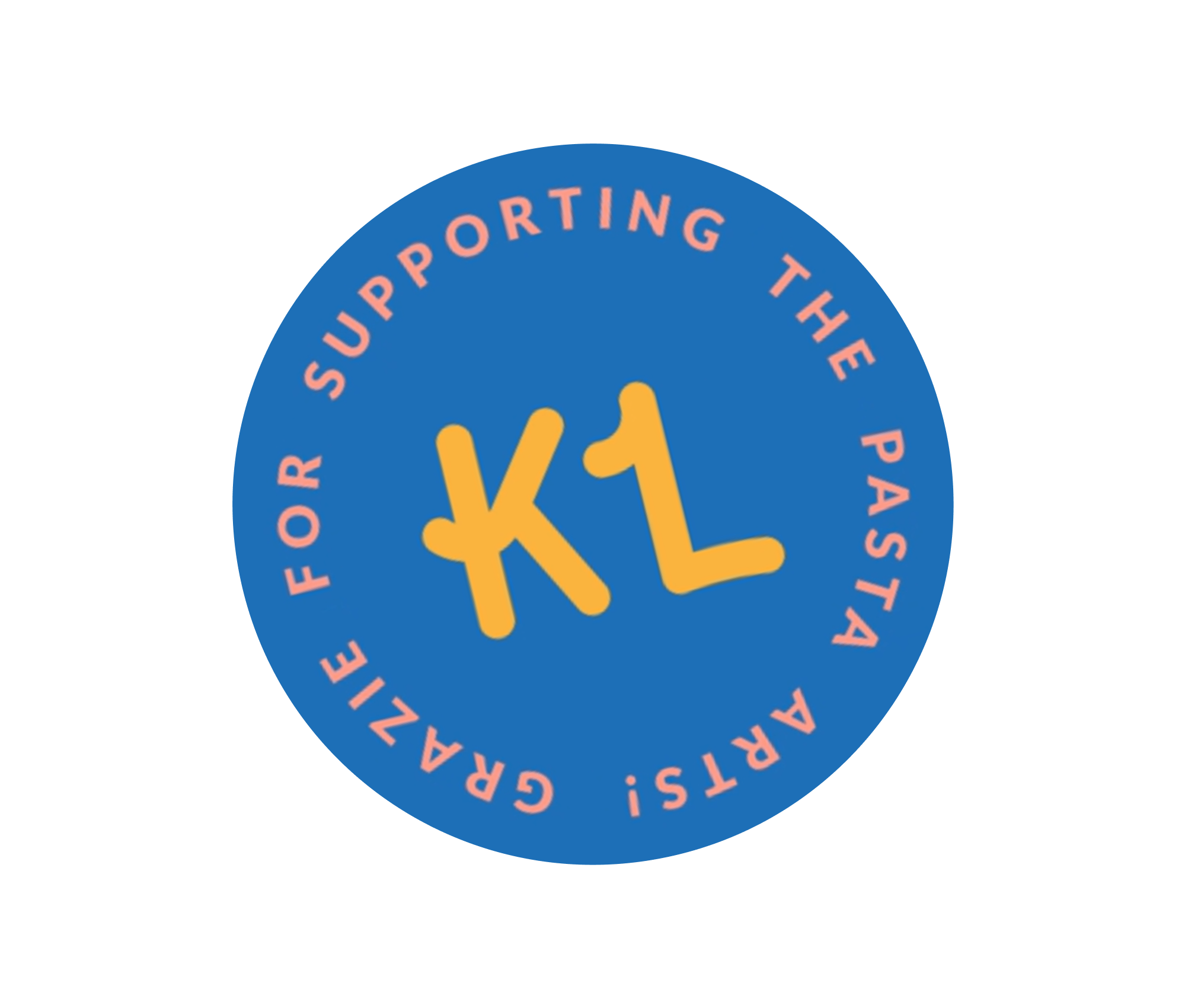
The answer came in custom typography, a playful take on a primary color scheme, and a squiggle that could evoke pasta, frosting decoration or a pen’s mark. The letterforms for her name provide a mix of the professional all-caps used in old hand painted logos, but with that extra noodle curve at the right moments. As if she wrote it in frosting herself. The system is rounded out by custom illustrations for the pasta shapes that she sells.
SERVICES
Branding
Design Strategy
Illustration
Web Design
CREDITS
Photography by Katie Leaird and Jocelyn Filley from @katieleairdfood