Mise: ATK’s Design System
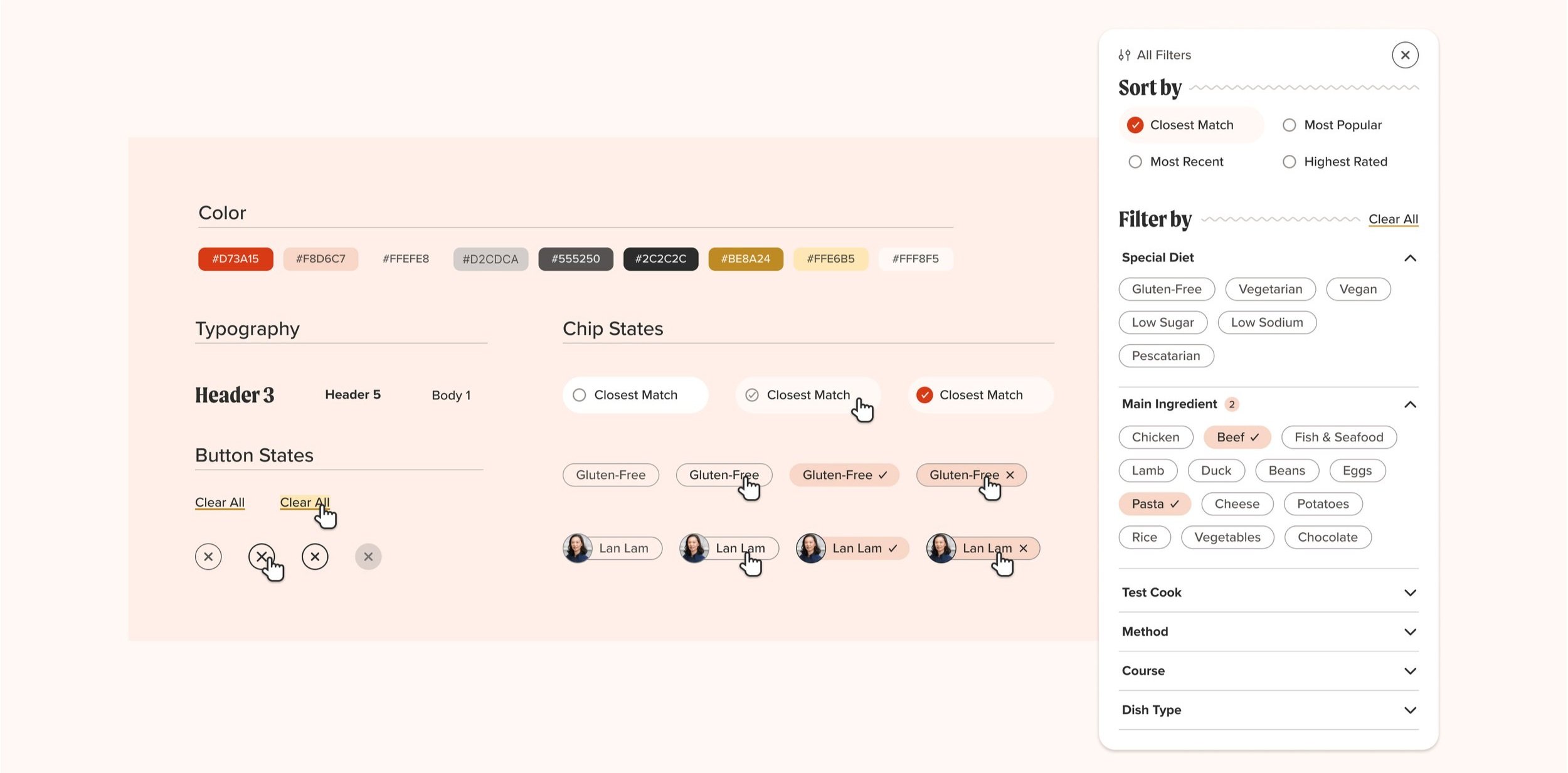
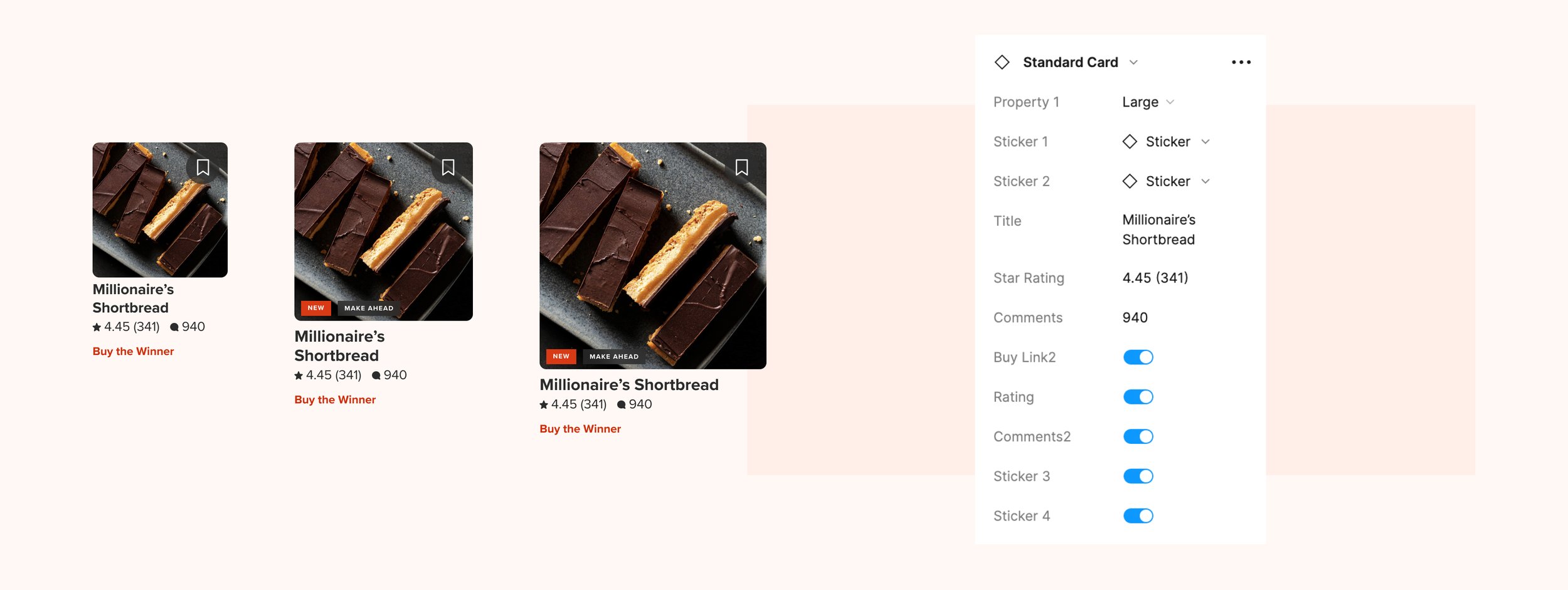
"Mise en place" is a common French phrase used in kitchens, meaning to "put in place." It refers to preparing ingredients and gathering tools before cooking, making the process less stressful and time consuming. This principle inspired ATK’s design system, Mise. Mise provides ready-to-use elements for designing digital products, from basics like typography and colors to complex components like card styles and navigation. It empowers the team to create visually appealing, effective designs that align with our brand.
Challenge
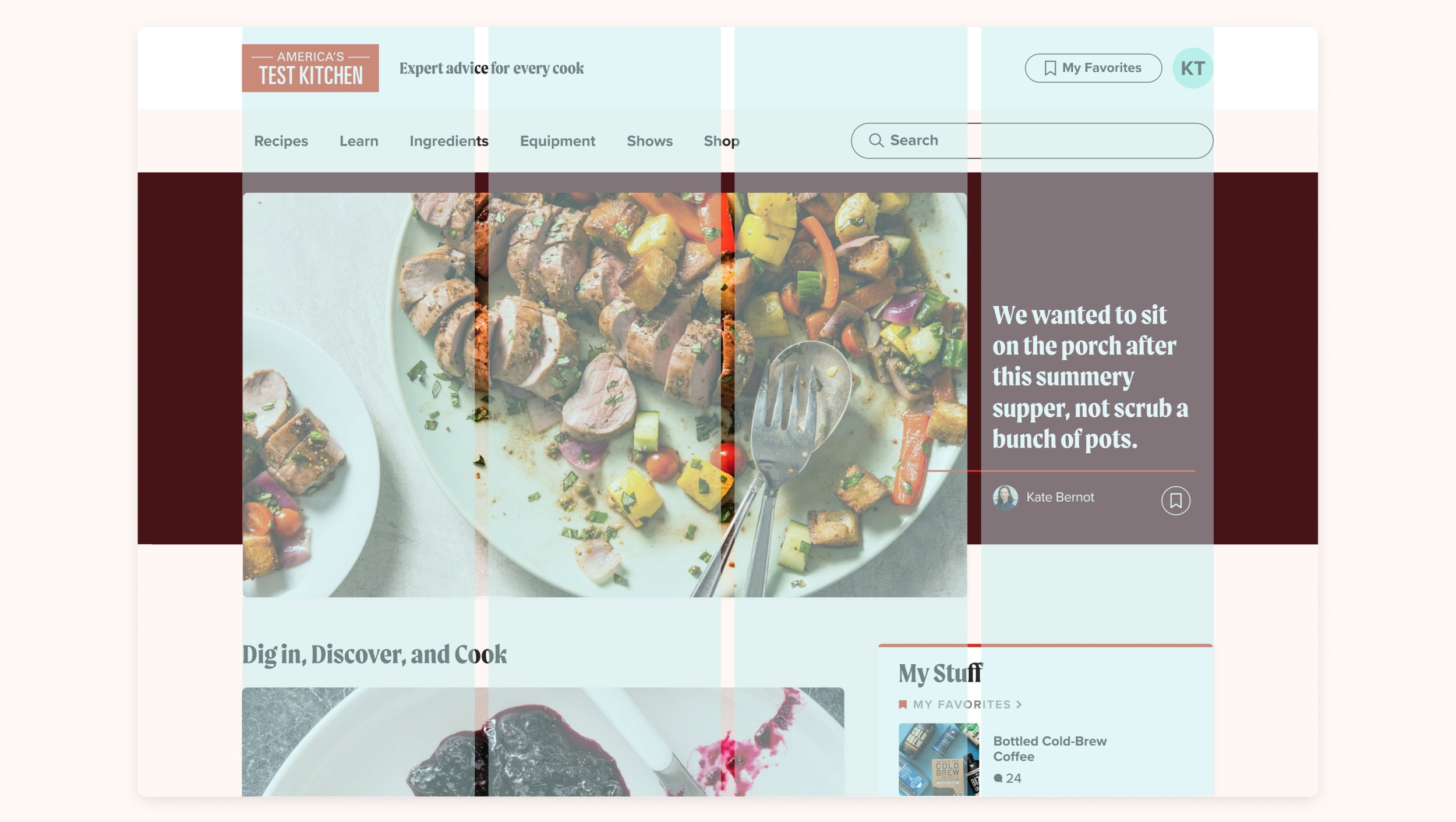
The initial version of the design system was complex due to the diverse needs of the America’s Test Kitchen brand, which consists of three sub-brands. It had to accommodate all content types and user states in a way that adjusted to each brand's environment. After rounds of incremental improvements, new user research, and updated company goals, we decided to consolidate the brands under one parent brand experience. This strategic shift coincided with a transition from Adobe XD to Figma, facilitating the creation of a new Mise design system within an updated workflow.
Goals
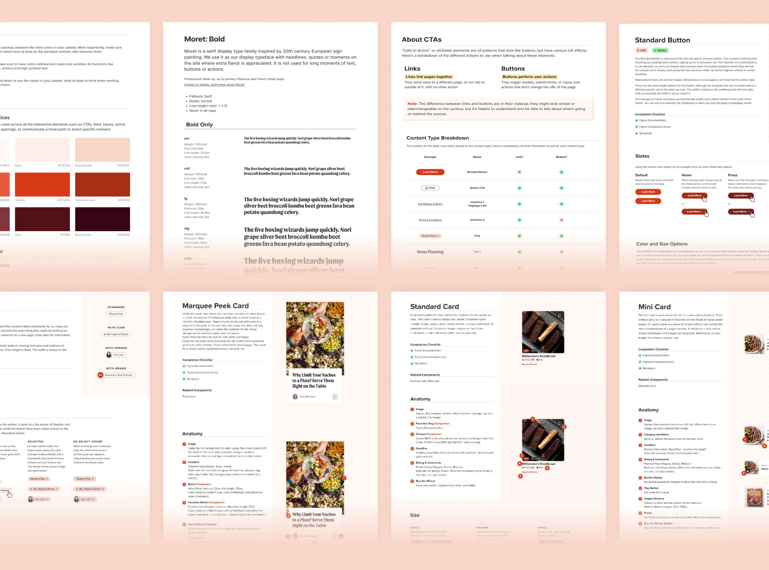
Create a source of truth for all UI styling, behavior, motion and language
Speed up time necessary for discovery, prototyping, testing and delivery
Build partnership between Figma and Storybook to keep design and development in sync
Ensure accessibility guidelines and a consistent experience for all users
Outcome
Mise now supports ATK’s core site and app experiences. We've collaborated with developers to connect Figma with Storybook, enhancing visibility and understanding of Mise across the product, editorial, and marketing teams. Furthermore, we've integrated accessibility guidelines throughout the design system, from color contrasts to forms and navigation, ensuring an inclusive user experience at every stage. This consolidation, enriched by its features, offers clarity and simplicity, ultimately benefiting both the product team and ATK’s customers.
While the updated Mise has yet to reach all corners of the product, its impact has already been felt and appreciated.
Increased design speed and stakeholder approval process
Reduced QA time and number of clarification rounds
A fostered a sense of shared ownership across product teams
SERVICES
Creative Direction
UI Design & Prototyping
System Development
Accessibility Best Practices
Figma-to-Storybook Tool Management


“The mise library is a great tool when new features are being developed because QA is able to refer to it for any information needed if we're uncertain. Every component, font, font size, color, and more is there for us to reference!” - Head of QA
DESIGN TEAM
Abi Hijeck, Associate Design Director
Ashley Tenn, UX Research
Alexandra Boeri, AJ Estrada, Bradford Rusick, Daniella Barrera, & Taylor Gonzales, Product Design
Kate Tetreault, Director of Product Design