America’s Test Kitchen needed a new homepage that balances with it’s precise navigation by providing a space for exploration, discovery, and inspiration.
SERVICES
Creative Direction
UI Design
Prototyping for Testing
Accessibility Best Practices
Challenge
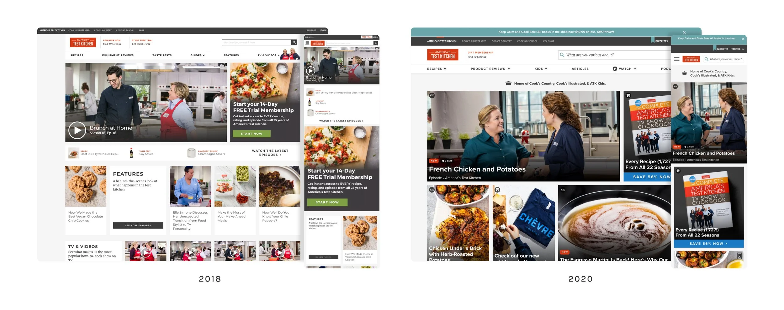
ATK's homepage was disorganized and cluttered, displaying a chaotic and random assortment of content instead of highlighting the best, most recent, and most useful work. There were also missed opportunities to illustrate the relentless efforts to support and inspire home cooks by focusing too much on repeatedly emphasizing who ATK is. And in a crowded market, the primary goal is to aim for reliability over confusion.
Home cooks said:
“I see a lot of things here that I can buy, but I can’t figure out how to explore things that benefit me…”
“There are other options that don’t feel as overwhelming.”
“If this wasn’t a test, I would have already closed the tab”
Goals
Make the user’s experience simple, clear, engaging, and familiar
Promote curiosity by prioritizing learning moments over additional clicks
Recreate the unique experience of being in the Test Kitchen, showcasing exciting discoveries
Express how ATK enthusiastically supports home cooks, focusing on the "why" and the "what" equally
Solution
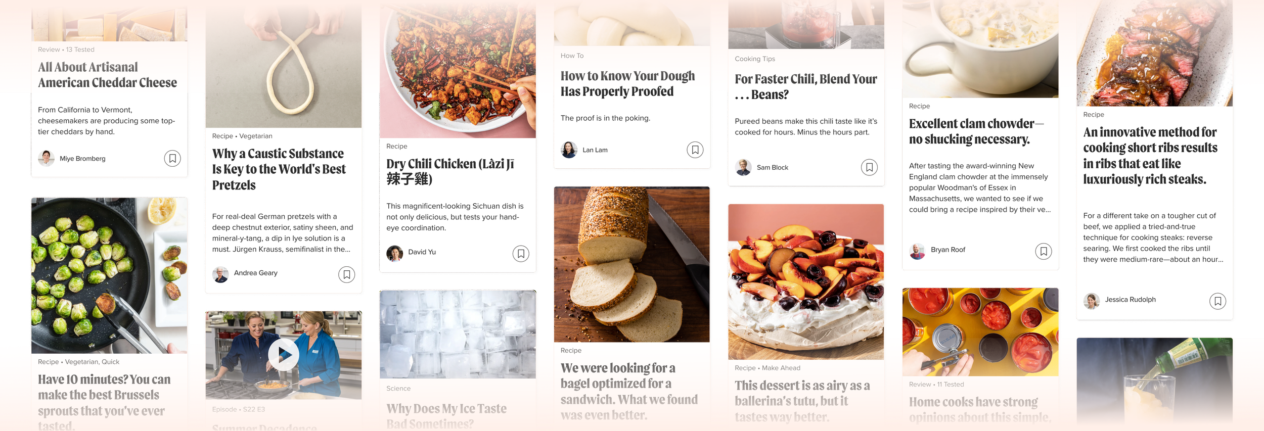
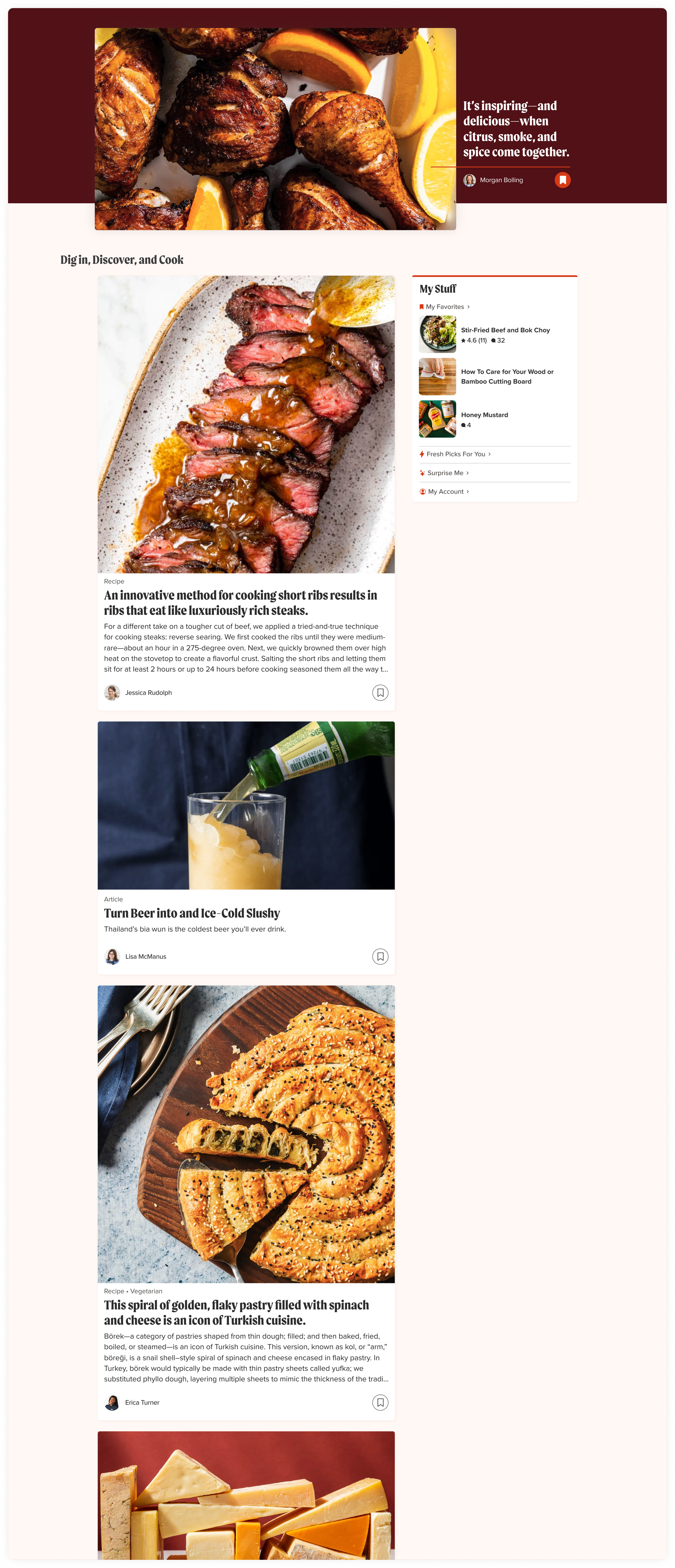
Our redesigned homepage provides fresh content for each visitor multiple times a day. We implemented a new design system card to emphasize discovery, allowing users to engage with the purpose of the content before clicking further. Like popular social platforms, our site is frequently updated, narrative-driven, and easily digestible.
Moreover, we highlighted the user's journey with us directly on the page, showcasing their recent searches, saved content, and custom-curated collections. This approach extends personalization beyond the login icon, making the homepage more user-centric.
Early Results
Since the relaunch, we've seen an immediate increase in people saving content from the homepage. This shows us they appreciate its simplified, generous shift from displaying our entire dense catalog to a system focused on simplicity, learning, and nerdiness. We were also encouraged by the feedback we received during some unmoderated tests.
“I like that this site feels like it might have a plan for you– there’s lots of decisions to make when [you’re cooking and] you don’t have anything planned!”
“One-stop shop– I imagine you can do ANYTHING related to cooking here!”
“I feel like I’d be able to really learn new things here.”


DESIGN TEAM
Abi Hijeck, Associate Design Director & lead UI designer
Ashley Tenn, UX Research
Kate Tetreault, Director of Product Design
John Torres, Creative Director
