America’s Test Kitchen’s new navigation system now makes it easier for you to find exactly what you need, even if you're unsure of what you're searching for.
SERVICES
Creative Direction
UI Design
System Development
Interactive Prototyping
Problem
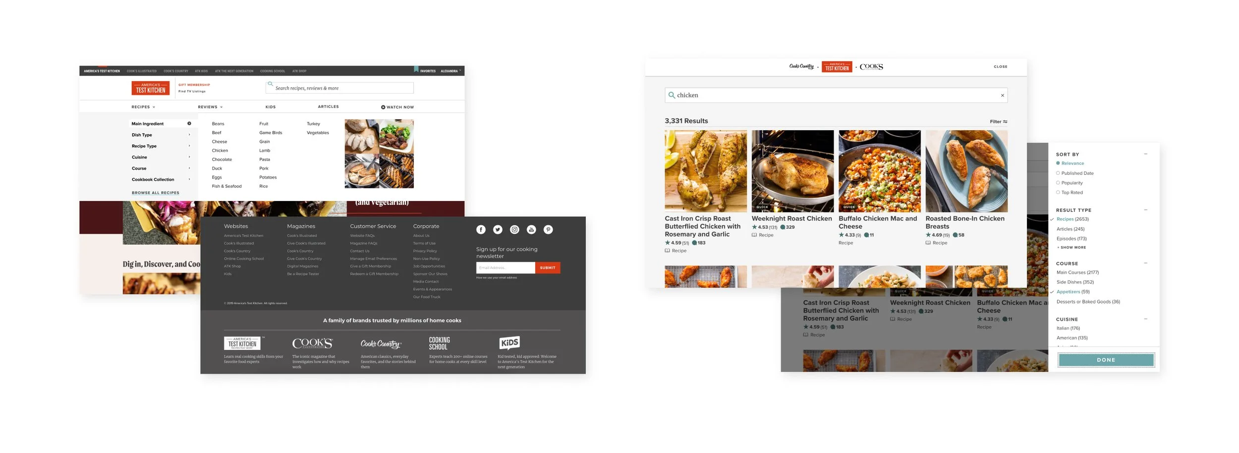
Members have repeatedly expressed frustration with ATK's site navigation, finding the header, footer, and search results to be cluttered and ineffective in guiding their discovery
This is partly due to ATK's long legacy of multiple brand websites, varying menus, and brand-centered search tags. These elements inadvertently emphasized large projects rather than showing that ATK caters to a wide range of diverse constraints. As the company transitioned to a single site approach, they wanted to focus on customer-centered navigation, helping people find recipes that meet their needs quickly.
Research
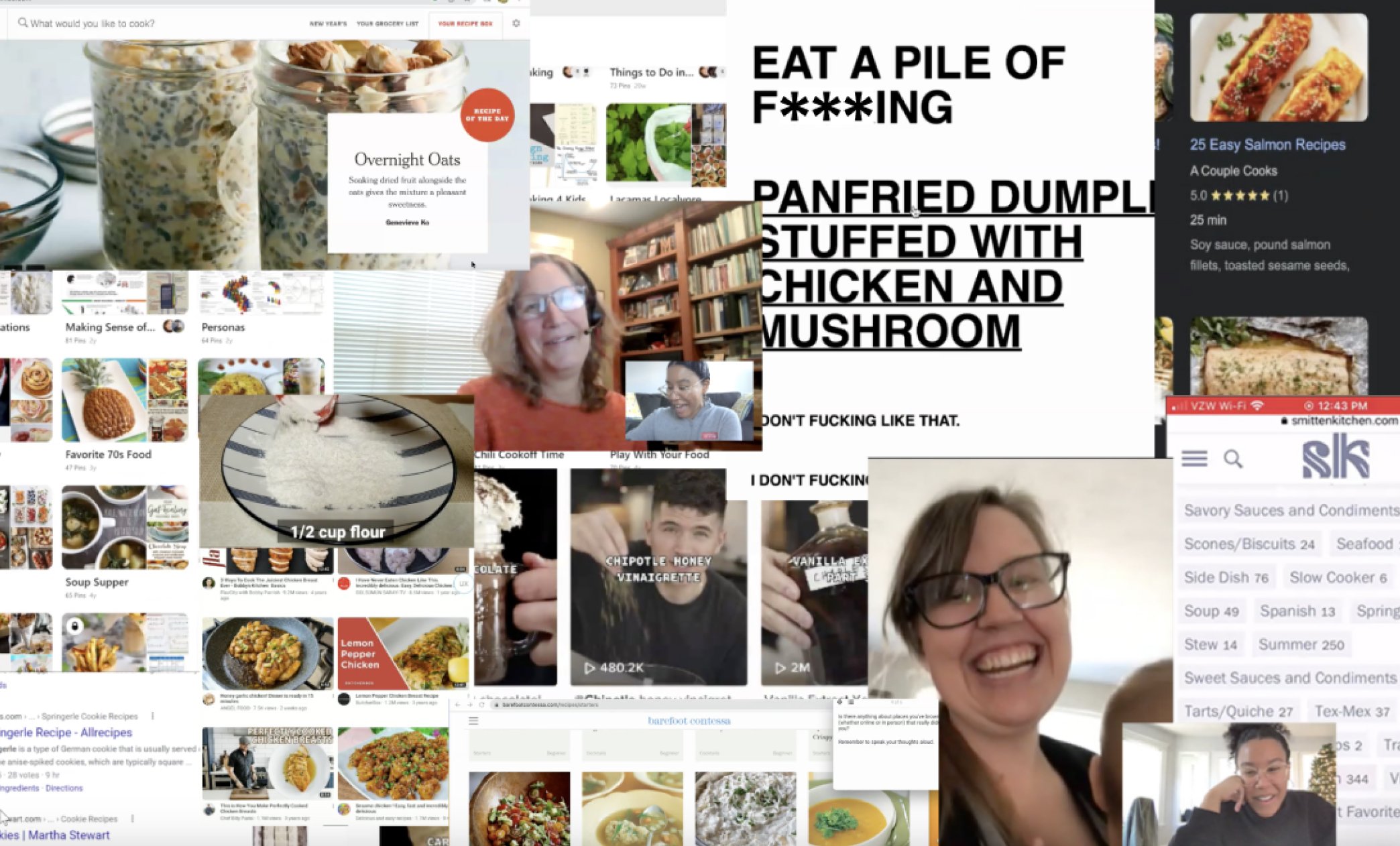
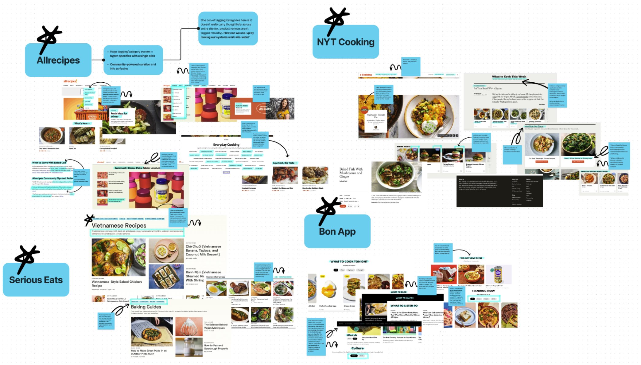
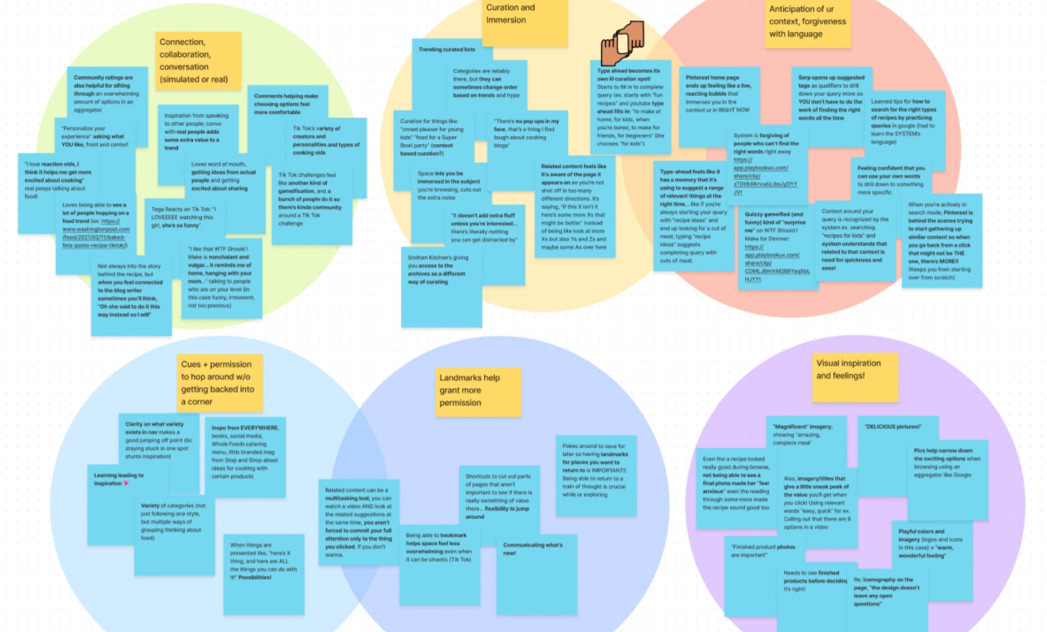
Our UX Research Expert on this project, Ashley Tenn, conducted various research projects including a competitive analysis, a co-design panel, and both moderated and unmoderated discovery sessions to help us discover insightful prompts leading us to ask questions that impacted goals, like:
Can we take more meaningful ownership of the changing brand identity?
Can we find impactful and creative ways to respond to people’s varied needs?
Can we help people get into a flow state without backing them into corners?
Can we bring more of the sensory world into the digital landscape?
Goals
Creating content discovery that is reliable, fast, comfortable, accessible, convenient, affordable, and safe - just like good transport
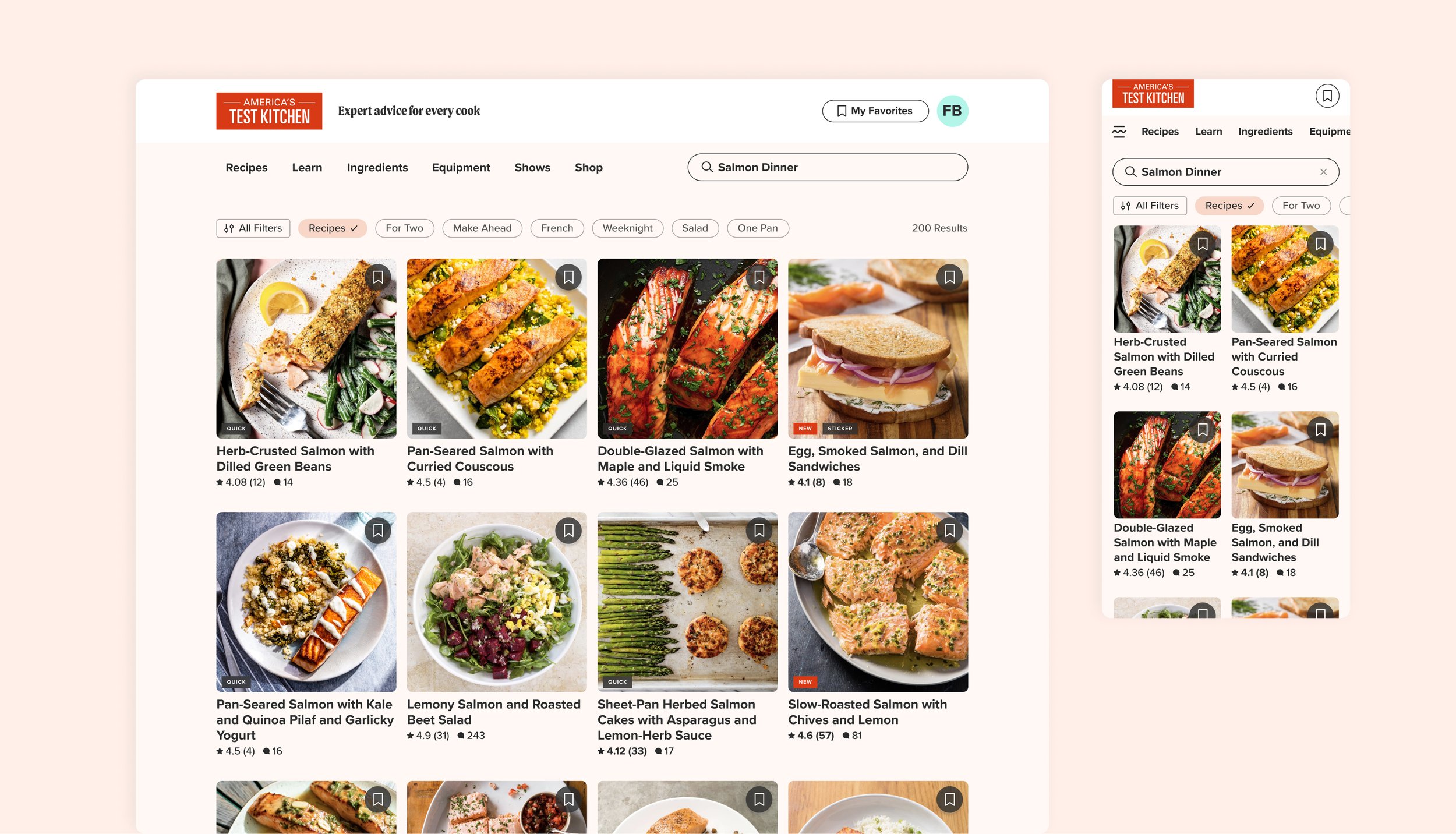
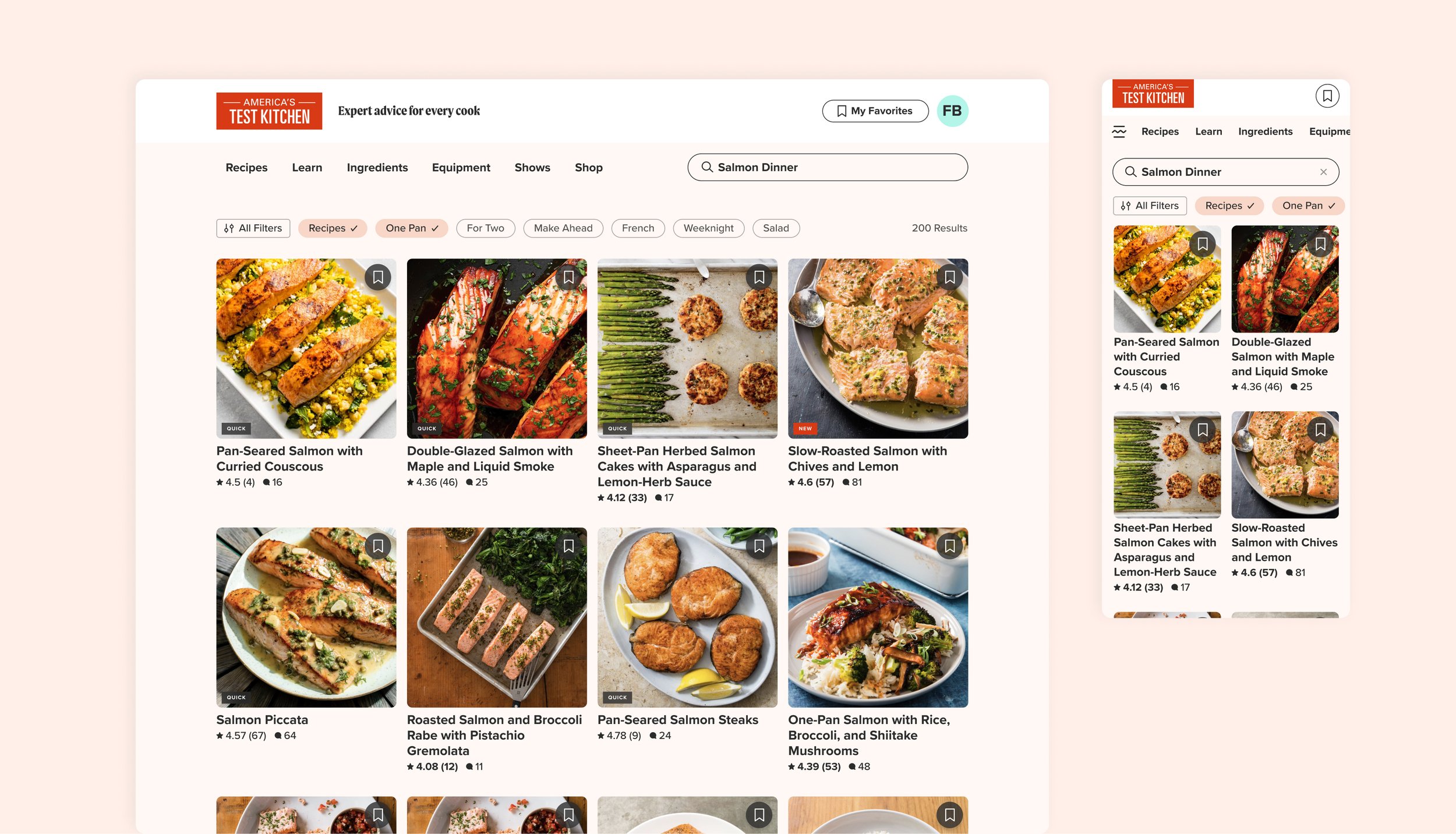
Providing filters that are intuitive and easy to use
Keeping the user interface consistent across search and browsing features, emphasizing that both aim to help you find the content you're looking for
Solution
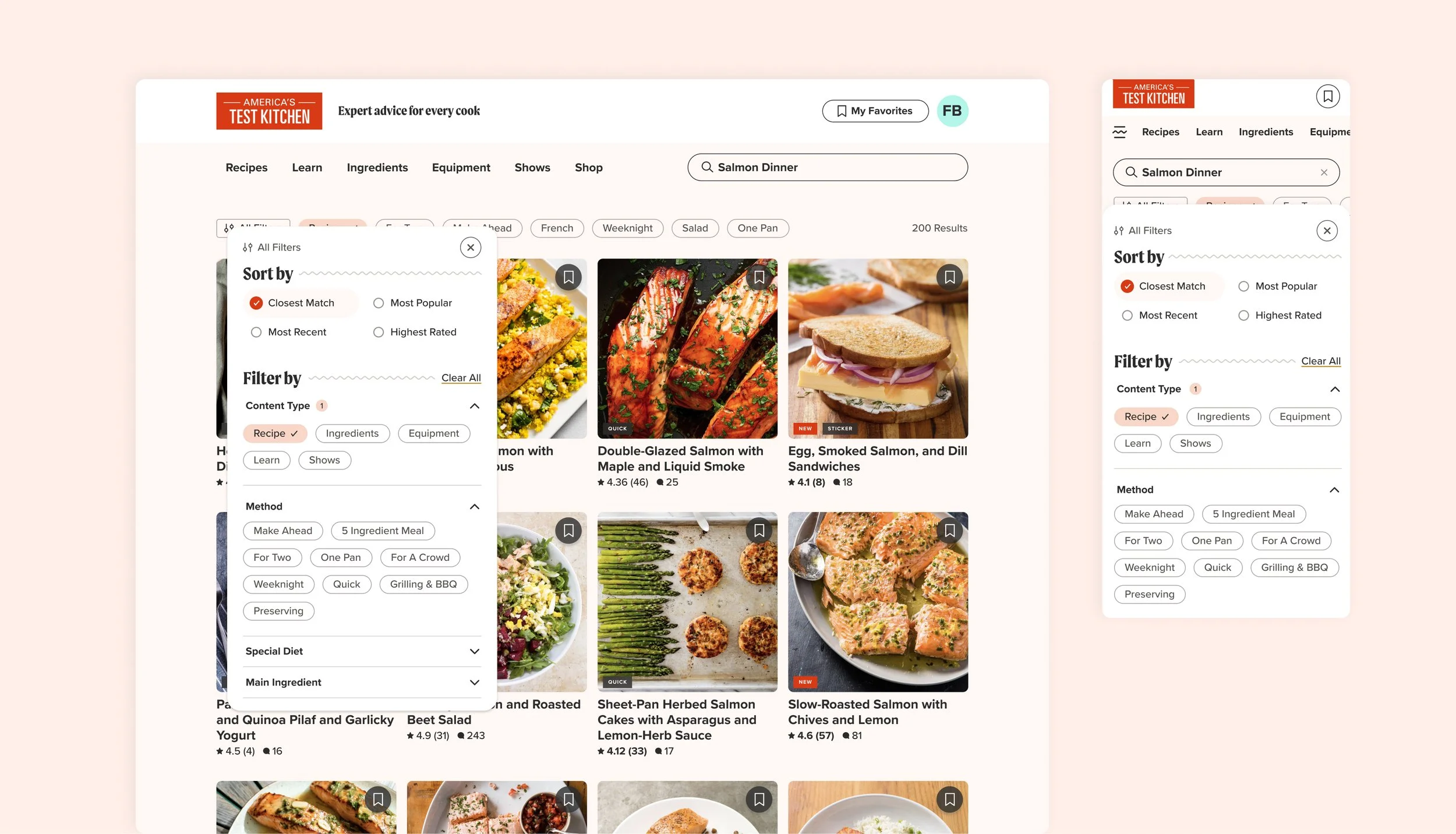
We're focusing on the journey, not the map. ATK's simplified header and footer now provide more room for the important elements to shine. The header highlights ATK's parent brand and mission alongside a navigation bar that focuses solely on our brand pillars, leaving more room for a prominent search bar. When engaging with the menu, we're purposefully showing only high-value, timely categories that encourage browsing.
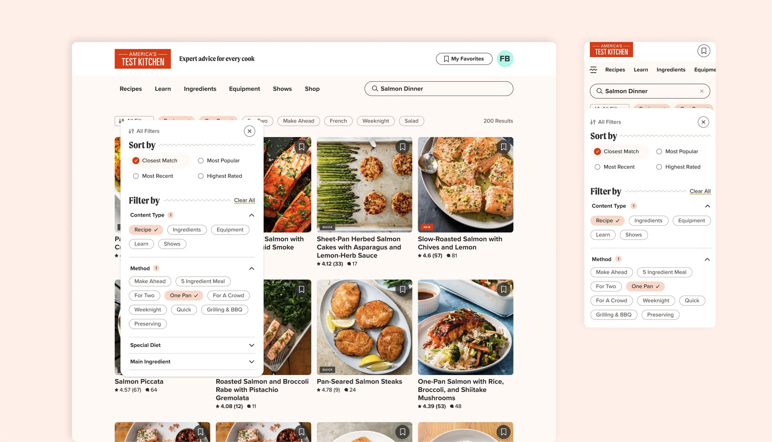
For search, we've added a more robust and helpful preview system that utilizes type-ahead and recipe previews to help narrow someone's search right away. We're also focusing on customer-centric filters and real-time updates, thinking more about how someone might search for a recipe rather than how we might internally categorize it.
Outcome
ATK’s new cohesive wayfinding system uses more natural language with a consistent interface across search and browse, allowing customers to focus more on enjoying their exploration, rather than wondering if or how they’ll get there. This is a new project that is still being iterated on, but we've received early positive feedback during user testing and are eager to see how it continues to improve and benefit future users.
DESIGN TEAM
Abi Hijeck, Associate Design Director & lead UI designer
Ashley Tenn, UX Research
Kate Tetreault, Director of Product Design
John Torres, Creative Director
