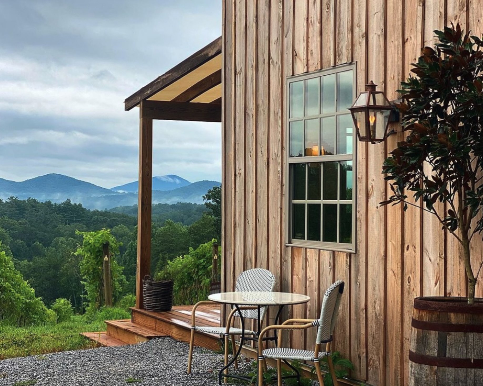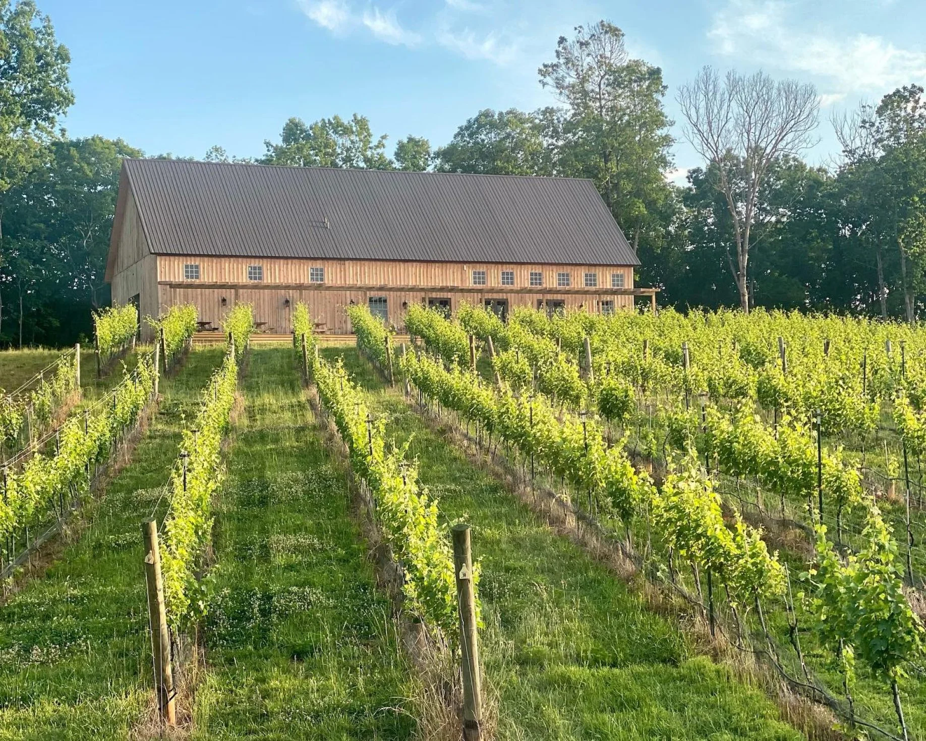
The Limoges’ bring a casual confidence to their work, one that marries the beauty of north Georgia’s landscape with the old-world style of a European vineyard.
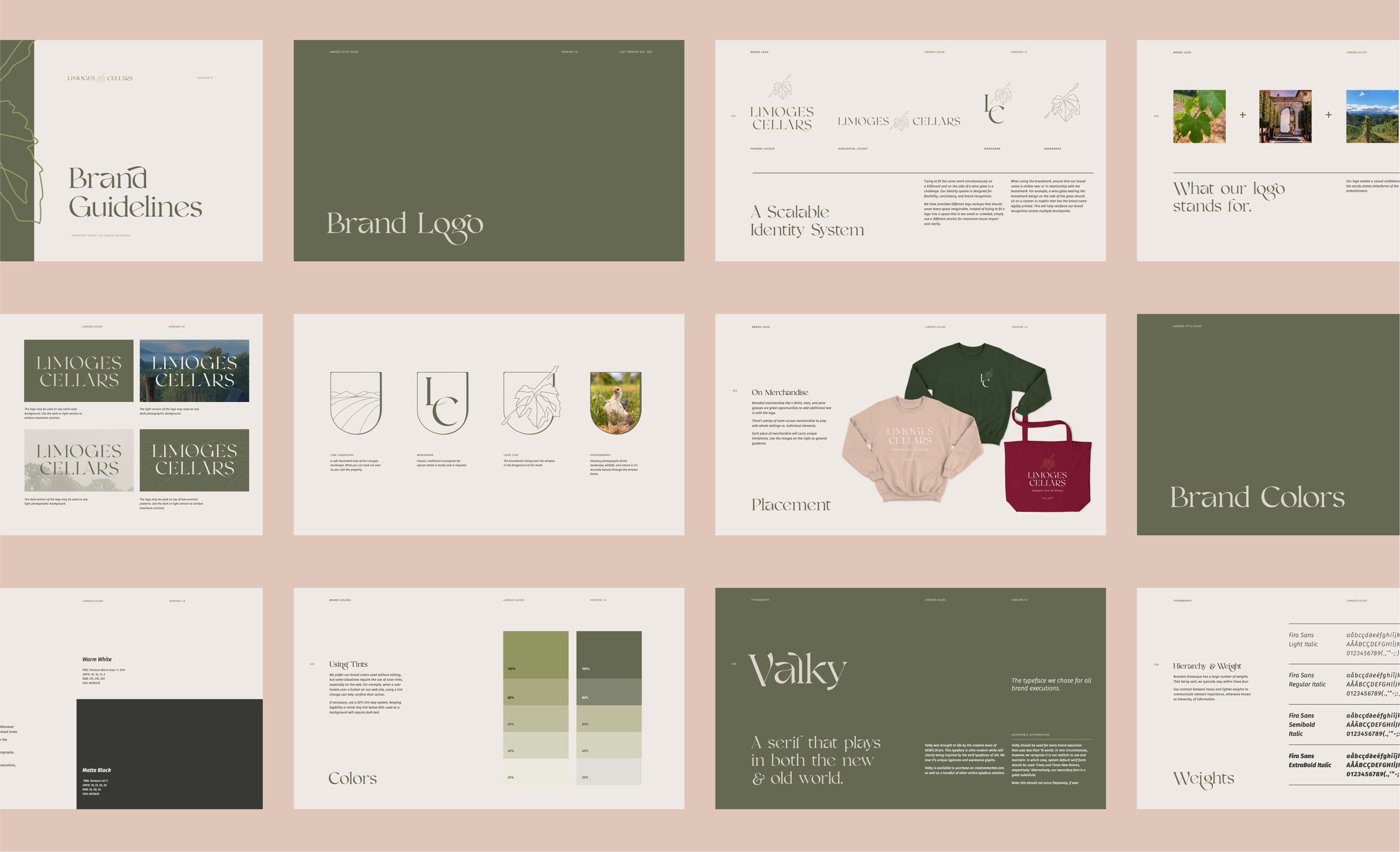
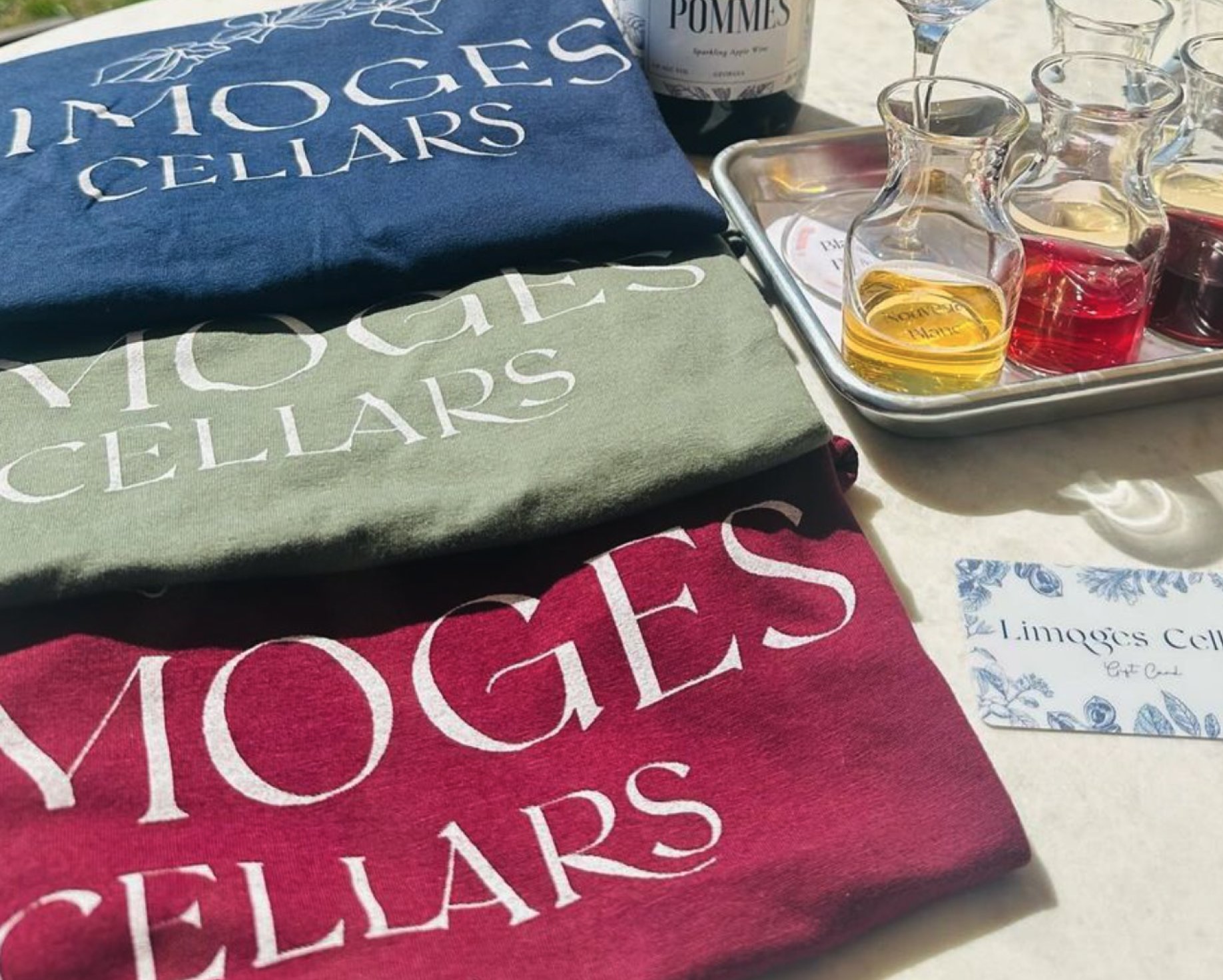
Limoges Cellars is a vineyard, farm and winery. Its beauty is not just in its offerings but in the fact that it is truly an escape from daily life. When we started their branding project, we wanted to create a brand system that encouraged quiet, rest and to take in the nature around you.
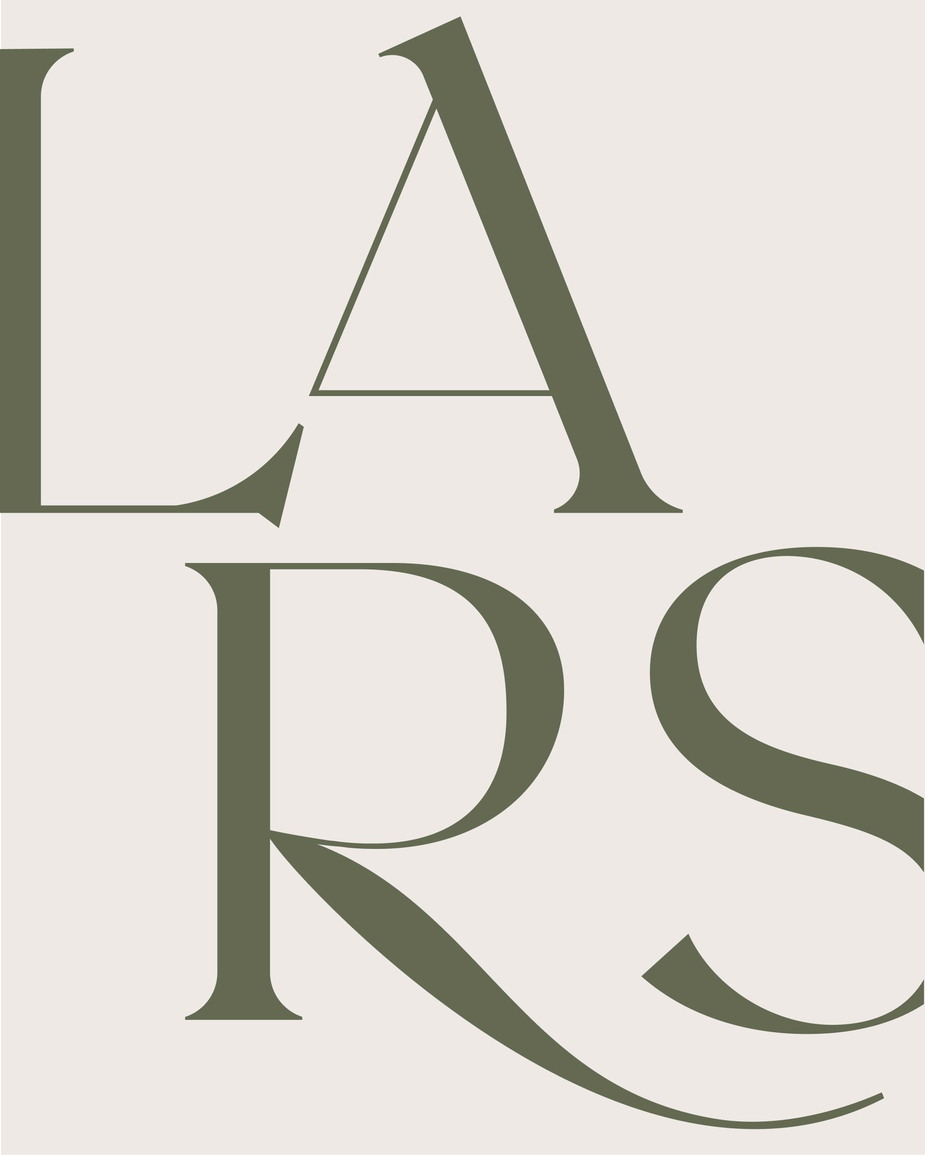
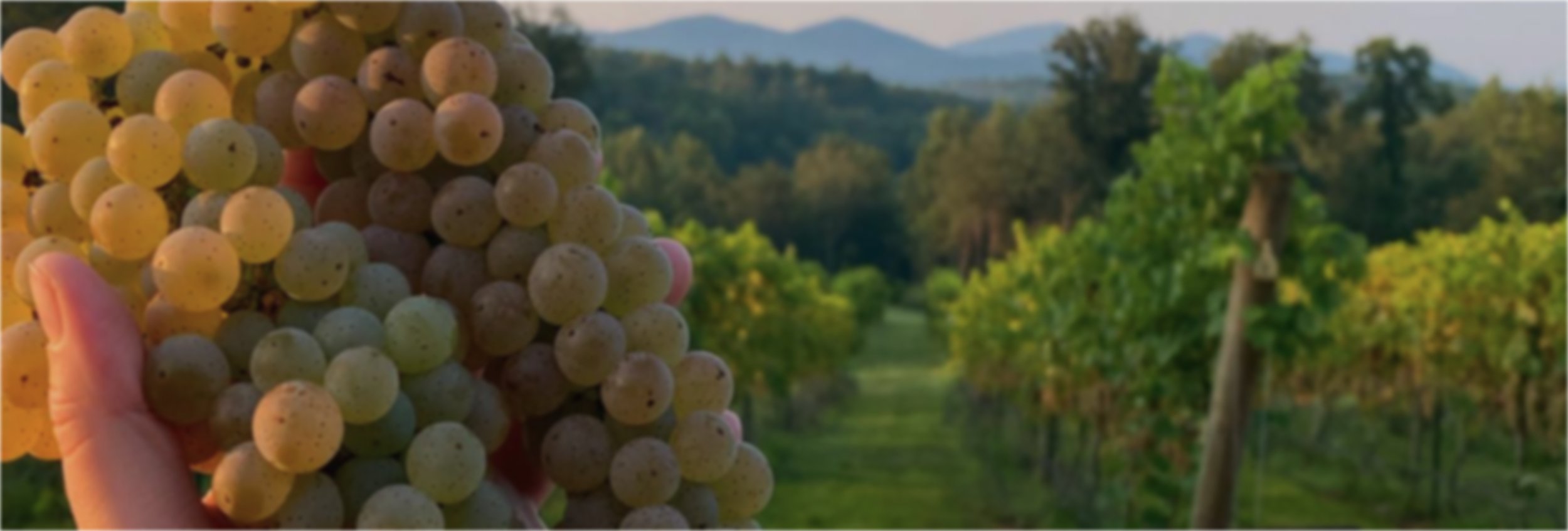
The logo mark reflects both the natural vine's varying thicknesses and curves, and the sturdy, stately letterforms of the old world. We chose colors that embody the natural terroir of the region, keeping tones soft and restful for the eye.
The grape leaf speaks to the beauty that nature is without embellishment. Soft window cutouts are turned on their head to resemble a wine glass, used to provide a peek of the landscape and experience.