America's Test Kitchen Reviews Redesign
SERVICES
Creative Strategy
UI Design
Challenge
America’s Test Kitchen's Review Team conducts comprehensive research and testing to guide customers on kitchen purchases, use and care. Their work covers everything from cast iron skillets to jarred pickles. This information is both highly valuable and broken up across multiple pages on three brand sites, forcing users to navigate various pages to understand the what, why and how for each item. This scattered approach was not serving our curious users or our Reviews Team effectively. When starting this consolidation project, we looked at ways to reduce the cognitive load of reading reviews and increase clarity and joy for the user.
Goals
Reduce the cognitive load required to get a both cumulative & scannable education around specific kitchen ingredients and equipment
Assist home cooks at various stages of their journey, from purchase to care, in one place
Achieve affiliate revenue targets
Solution
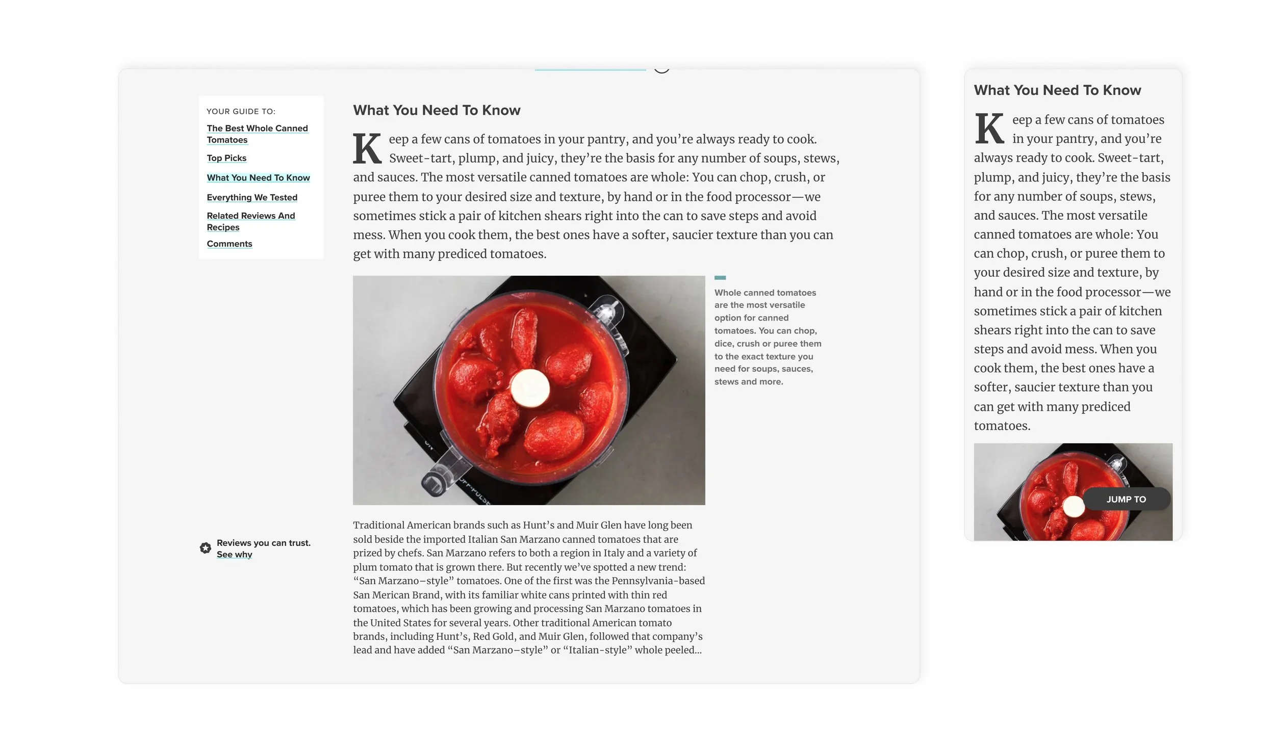
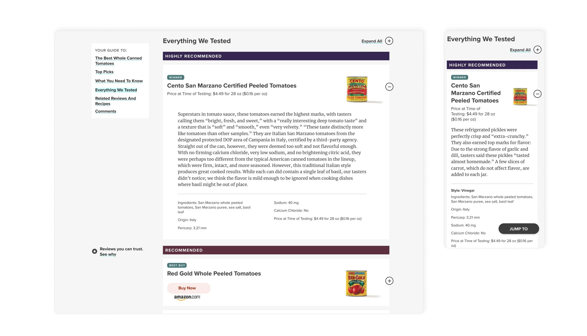
A new detail page brings all knowledge we have around a product (testing process, buying recommendations, how to’s, recipes to make, and other related products) together in one place. It gives users the structure to explore based on what they need in the moment, and support for how to come back over repeat visits. It also gives editors the option to flex the template to best tell the stories that need telling. The integration of article content also gave us the opportunity for a meaningful expansion of Mise UI, our design system. We worked closely with Dev and Editorial to audit the legacy CMS and determine what components existed, needed to be updated, or created.
Ultimately, our users and editors both received more support, and the business is seeing the benefits:
A significant decrease in bounce rate
A measurable increase in affiliate revenue
Editorial Design System and its CMS counterparts are being extended to the full editorial team
Follow Up: A New Component
After launching the consolidated reviews page, we continued to iterate and add new features. Here is an example:
We realized that by suggesting only one buying option, we were missing out on potential earnings and forcing our members to search for the best deals and availability elsewhere. We decided to design and test a multi-retailer shopping experience that allows consumers to compare and shop directly from the reviews page. We hope this further supports customers in making the best decisions for themselves.
Goals
Design a component that’s easy-to-use, helpful and not “spammy”
Include appropriate choices and real price comparison data
A design that balances the new and old design systems, as the timelines for the new design system overlap
Solution
We adapted our reviewable cards to fit into the new design system, and also include purchase options. Rather than stacking many buttons, distracting from why we preferred that item, we opted for a dropdown when more than one option is available. This allows the user to choose when they want to compare. If there is only one buying option, that dropdown simply becomes the button that takes you to purchase.
DESIGN TEAM
Abi Hijeck, Phase 1, Deputy Art Director; Phase 2, Associate Design Director Design
Tabitha Rodrigue, Design Director (for Phase 1 of this project)
Kate Tetreault, Director of Product Design


